
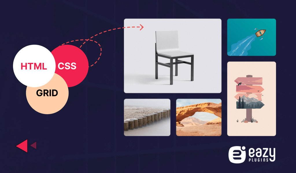
Are you looking for the perfect way to create an image grid in HTML CSS? Then you must read the whole article.
When you create an image grid it not only adds an extra effect on your website but saves space as well. If you add one image after another then it will not look good. Rather it can annoy the users.
In that case, an image grid and adding lots of pictures can give a professional vibe to your website. However, you may wonder if creating an image grid will require professional help.
But what if I tell you that if you have some coding knowledge you can create an image grid in HTML CSS easily?
Yes, that is possible. Using some simple codes and customizations can easily create an image grid for your website.
How to Add an Image Grid in HTML CSS
Adding an image grid using HTML and CSS is very easy if you know the code behind it. With simple tweaks, you can easily create an image grid that will serve your purpose.
Add Image Gallery with HTML Code
<!DOCTYPE html>
<html lang="en">
    <head>
        <meta charset="UTF-8">
        <meta name="viewport" content="width=device-width, initial-scale=1.0">
        <meta http-equiv="X-UA-Compatible" content="ie=edge">

        <link href="https://fonts.googleapis.com/css?family=Josefin+Sans:300,400,400i|Nunito:300,300i" rel="stylesheet">
        <link rel="stylesheet" href="css/style.css">
        <link rel="shortcut icon" type="image/png" href="img/favicon.png">

        <title>CSS Grids Gallery</title>
    </head>
    <body>
        <div class="container">
            <div class="gallery">
                <figure class="gallery__item gallery__item--1">
                    <img src="img/image-1.jpg" alt="Gallery image 1" class="gallery__img">
                </figure>
                <figure class="gallery__item gallery__item--2">
                    <img src="img/image-2.jpg" alt="Gallery image 2" class="gallery__img">
                </figure>
                <figure class="gallery__item gallery__item--3">
                    <img src="img/image-3.jpg" alt="Gallery image 3" class="gallery__img">
                </figure>
                <figure class="gallery__item gallery__item--4">
                    <img src="img/image-4.jpg" alt="Gallery image 4" class="gallery__img">
                </figure>
                <figure class="gallery__item gallery__item--5">
                    <img src="img/image-5.jpg" alt="Gallery image 5" class="gallery__img">
                </figure>
                <figure class="gallery__item gallery__item--6">
                    <img src="img/image-6.jpg" alt="Gallery image 6" class="gallery__img">
                </figure>
            </div>
        </div>
    </body>
</html>
If you look closely we have added 6 galleries ( Gallery image 1, Gallery image 2, Gallery image 3, Gallery image 4, Gallery image 5, and Gallery image 6). With CSS you can customize every gallery separately or you can add the same styling to every gallery.
Also Read: Best grid Plugins for Your Website
Customize Separately with CSS Code
*,
*::after,
*::before {
  margin: 0;
  padding: 0;
  box-sizing: inherit;
}

html {
  box-sizing: border-box;
  font-size: 62.5%;
}

body {
  font-family: "Nunito", sans-serif;
  color: #333;
  font-weight: 300;
  line-height: 1.6;
}

.container {
  width: 60%;
  margin: 2rem auto;
}

.gallery {
  display: grid;
  grid-template-columns: repeat(8, 1fr);
  grid-template-rows: repeat(8, 5vw);
  grid-gap: 1.5rem;
}

.gallery__img {
  width: 100%;
  height: 100%;
  object-fit: cover;
  display: block;
}

.gallery__item--1 {
  grid-column-start: 1;
  grid-column-end: 3;
  grid-row-start: 1;
  grid-row-end: 3;

  /** Alternative Syntax **/
  /* grid-column: 1 / span 2;  */
  /* grid-row: 1 / span 2; */
}

.gallery__item--2 {
  grid-column-start: 3;
  grid-column-end: 5;
  grid-row-start: 1;
  grid-row-end: 3;

  /** Alternative Syntax **/
  /* grid-column: 3 / span 2;  */
  /* grid-row: 1 / span 2; */
}

.gallery__item--3 {
  grid-column-start: 5;
  grid-column-end: 9;
  grid-row-start: 1;
  grid-row-end: 6;

  /** Alternative Syntax **/
  /* grid-column: 5 / span 4;
  grid-row: 1 / span 5; */
}

.gallery__item--4 {
  grid-column-start: 1;
  grid-column-end: 5;
  grid-row-start: 3;
  grid-row-end: 6;

  /** Alternative Syntax **/
  /* grid-column: 1 / span 4;  */
  /* grid-row: 3 / span 3; */
}

.gallery__item--5 {
  grid-column-start: 1;
  grid-column-end: 5;
  grid-row-start: 6;
  grid-row-end: 9;

  /** Alternative Syntax **/
  /* grid-column: 1 / span 4; */
  /* grid-row: 6 / span 3; */
}

.gallery__item--6 {
  grid-column-start: 5;
  grid-column-end: 9;
  grid-row-start: 6;
  grid-row-end: 9;

  /** Alternative Syntax **/
  /* grid-column: 5 / span 4; */
  /* grid-row: 6 / span 3; */
}
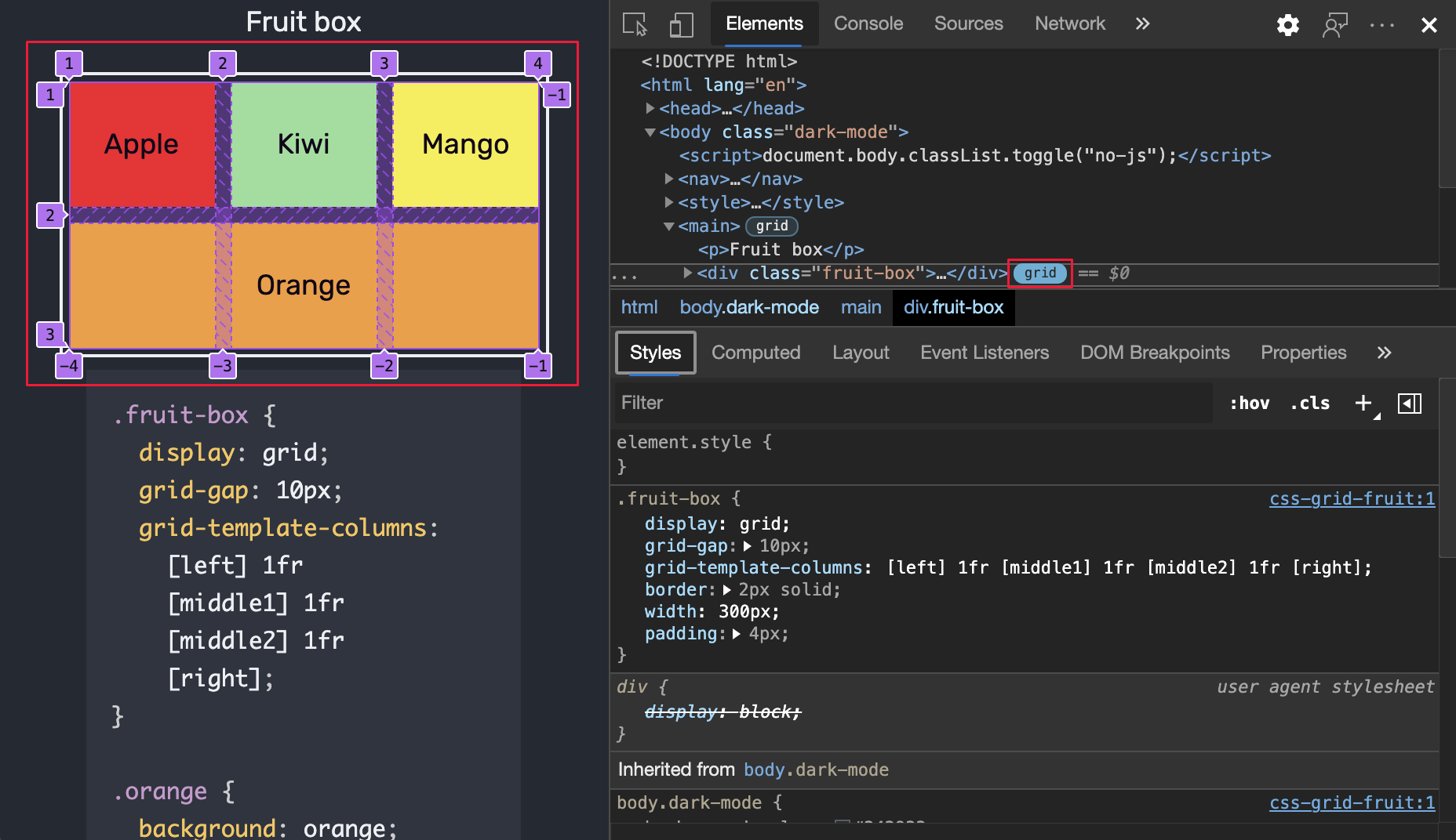
The “grid-column-start” indicates the column grid line where the first grid item starts. Whereas the “grid-column-end” indicates where the first grid item ends.
If the value of the grid-column-start is set to 1 and grid-column-end is set to 3 means that the grid item will stretch from the left edge of the grid line, line 1 to line 3, filling up 2 columns.
The “grid-row-start” and “grid-row-end” indicate the grid item start and end position on the row grid lines.

You can try and add your own CSS to customize the image grid the way you want.
Control Your Image Grid with JavaScript!
However, if you want to control the image grid, even more, you can add javascript as well.
Here’s the full code with HTML, CSS & Javascript,
HTML:
<div class="row">
  <div class="column">
	<img src="wedding.jpg">
	<img src="rocks.jpg">
	 <img src="falls2.jpg">
	<img src="paris.jpg">
	 <img src="nature.jpg">
	<img src="mist.jpg">
	 <img src="paris.jpg">
  </div>
  <div class="column">
	<img src="underwater.jpg">
	 <img src="ocean.jpg">
	<img src="wedding.jpg">
	 <img src="mountainskies.jpg">
	<img src="rocks.jpg">
	 <img src="underwater.jpg">
  </div>
  <div class="column">
	<img src="wedding.jpg">
	 <img src="rocks.jpg">
	<img src="falls2.jpg">
	 <img src="paris.jpg">
	<img src="nature.jpg">
	 <img src="mist.jpg">
	<img src="paris.jpg">
  </div>
  <div class="column">
	<img src="underwater.jpg">
	 <img src="ocean.jpg">
	<img src="wedding.jpg">
	 <img src="mountainskies.jpg">
	<img src="rocks.jpg">
	 <img src="underwater.jpg">
  </div>
</div>
CSS:
.row {
  display: flex;
  flex-wrap: wrap;
  padding: 0 4px;
}

/* Create two equal columns that sits next to each other */
.column {
  flex: 50%;
  padding: 0 4px;
}

.column img {
  margin-top: 8px;
  vertical-align: middle;
}
JavaScript:
<button onclick="one()">1</button>
<button onclick="two()">2</button>
<button onclick="four()">4</button>

<script>
// Get the elements with class="column"
var elements = document.getElementsByClassName("column");

// Declare a "loop" variable
var i;

// Full-width images
function one() {
  for (i = 0; i < elements.length; i++) {
	 elements[i].style.flex = "100%";
  }
}

// Two images side by side
function two() {
  for (i = 0; i < elements.length; i++) {
	 elements[i].style.flex = "50%";
  }
}

// Four images side by side
function four() {
  for (i = 0; i < elements.length; i++) {
	 elements[i].style.flex = "25%";
  }
}
</script>
You can try and add your own CSS to customize the image grid the way you want.
FAQ(s)
How do I create a grid image in HTML?
To create a grid image in HTML, you have to set the display property to grid or inline grid. Grid containers consist of grid items, placed inside columns and rows.
What is grid in HTML CSS?
CSS grid means dividing a page into major regions or defining the relationship in terms of size, position, and layer, between parts of a control built from HTML primitives.
What is image grid?
A style that takes a list of image links/buttons and displays it in a grid is an image grid.
What is a grid used for?
If you want to organize graphic elements in relation to a page with aspect to other elements on the page you can use a grid.
What are grid items?
A grid container contains grid items. Moreover, a container has one grid item for each column, in each row, and you can style the grid items.
You Can Now Create Amazing Image Grids
So, fellas, use these codes to create an image grid or you can customize them per your requirements.
But don’t forget to test the code first on your staging or test site. Then implement it on the live website. That way you won’t face any issues on your running website and it will all go smoothly.
If you are still in some confusion please give us a shout-out in the comment section below.
You can also read this content- (Photo Grid WordPress Plugin: 6 Steps to Create Photo Grid Manually) ?