

If you are trying to make your site mobile optimized, then 2023 is the best time because of the mobile-first indexing by Google. That means Google is prioritizing the mobile version of your website to rank.
You can showcase your website to a broader audience consisting of 6.8 billion users all over the globe. Turning a mobile-friendly website is relatively easy and requires some simple techniques in a patterned way.
Below, we describe eight suggestions that will help you make your site mobile-friendly in a step-by-step guide. This will make the process more efficient and less time-consuming.
Let’s get started,
- You can Use a Mobile Responsive Theme
- Eliminate the Use of Heavy Effects on Your Website
- Improve Page Loading Speed
- Improve Content Readability
- Optimize Your Site for Mobile Checkout
- Make Your Website Easy to Navigate
- Make Your Pop-Up Windows Mobile Responsive
- Implement Chat Bots or Virtual Assistants
8 Experts’ Advice to Unlock the Power of Mobile Optimization in Your Website
1. You can Use a Mobile Responsive Theme
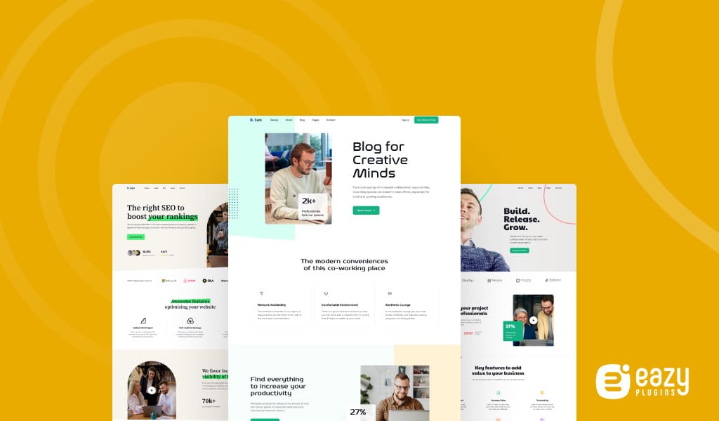
The first step in converting your website to a mobile responsive version is to use a responsive theme. You can follow the below instruction-
Step 1: Choose a responsive theme
Select a theme specifically designed to be mobile responsive. Many content management systems (CMS) like WordPress offer various responsive themes. Look for themes that explicitly mention being mobile responsive in their descriptions.
Step 2: Look out for different following factors
These factors is a must for a responsive theme,
- Cross-browser compatibility: Ensure the responsive theme is compatible with major web browsers like Chrome, Firefox, Safari, and Edge.
- Customization options: Look for themes that offer a good balance of customization options without sacrificing responsiveness.
- Support and updates: Choose a theme from reputable developers who provide regular updates and offer support in case you encounter any issues.
- Mobile-friendly features: Look for themes that offer mobile-specific features or enhancements, such as mobile menus, touch-enabled sliders, off-canvas navigation, or sticky headers.
Step 3: Install and activate the theme
Once you’ve chosen a mobile responsive theme, install it on your CMS platform. Follow the theme’s documentation or your CMS’s instructions to activate the theme on your website.
Step 4: Test the responsiveness
After activating the theme:
- Test its responsiveness across different mobile devices and screen sizes.
- Check if the layout adapts fluidly, the text is readable, and the navigation is easily accessible.
- Ensure the user experience is seamless and that all elements are appropriately displayed.
Divi, Avada, Astra, and OceanWP are popular mobile responsive themes. Also don’t forget to check if your theme is SEO-friendly or not.
Read More: 12 Most Effective WordPress Mobile Optimization Tricks
2. Eliminate the Use of Heavy Effects on Your Website
Having many different parallel effects on your site may give it a stunning look, but it takes away the ability to have a seamless mobile optimization experience. You can use them, but keep them minimal and avoid heavy effects.
a. Heavy animations
Complex and resource-intensive animations, such as large-scale parallax effects or CPU-intensive particle effects, can cause significant performance issues on mobile devices. Consider simplifying or removing these effects to improve loading speed and overall performance.
b. Excessive use of JavaScript
JavaScript-powered effects, such as extensive scrolling animations or interactive elements, can consume processing power and slow down mobile devices. Limit the use of JavaScript effects or opt for lightweight alternatives that prioritize performance.
c. Flash-based content
Flash is not supported on most mobile devices, including iOS devices. If your website still utilizes Flash-based content, it’s essential to eliminate or replace it with modern, mobile-friendly alternatives, such as HTML5 and CSS3 animations.
d. Overlapping or obstructive elements
Ensure that elements on your website do not overlap or obstruct important content when viewed on smaller screens. Elements like pop-ups, fixed headers, or sticky elements that may hinder readability or navigation on mobile devices should be carefully evaluated and optimized.
e. Background videos
Although background videos can enhance the visual appeal of a website, they can significantly impact loading times and consume data on mobile devices. Consider using static images or optimizing videos for mobile viewing, ensuring they don’t negatively affect performance.
f. Complex image carousels or sliders
Image carousels or sliders that involve multiple images, transitions, and auto-play functionalities can slow down your website’s loading on mobile devices. Simplify or replace them with a static image or a single prominent image that maintains a visually appealing design. If you are using Elementor, it’s normal that sometimes the image carousel may not work.
g. Multiple layers of content
Avoid stacking multiple layers of content that require scrolling within scrolling on mobile devices. This can lead to confusion and difficulty in navigating through the content. Streamline your design to provide a straightforward and intuitive user experience.
3. Improve Page Loading Speed

Research by Google indicates that as page load time increases from one second to three seconds, the probability of bounce rate increases by 32%. Furthermore, the bounce rate rises exponentially as load time increases, making the page load decrease a must.
Eliminating the usage of heavy effects is an excellent way to decrease your content loading time, but there are some other similar hacks and processes that can help you drastically improve your page loading speed.
i) Convert images to lower PNG qualities
Large image files can significantly slow down page loading. Compress images without compromising quality using tools like JPEGoptim or ImageOptim. One of the best ways to improve loading speed is converting any type of images in lower quality PNG sizes.
Additionally, consider using modern image formats like WEBP, which can offer better compression and faster loading times compared to traditional formats like JPEG and PNG. Consider keeping your image size to less than 100KB when uploading to the website.
ii) Minify CSS and JavaScript
Minifying your CSS and JavaScript files involves removing unnecessary characters, spaces, and line breaks without affecting functionality. This reduces file sizes and improves loading speed. Use tools like UglifyJS or CSSNano to minify your code.
iii) Leverage browser caching
Enable browser caching on the user’s device to store static resources, such as images, CSS files, and JavaScript files. This allows subsequent visits to your website to load these resources from the cache, reducing the need for repeated downloads.
4. Enhance Content Readability
Large blocks of text can be off-putting on smaller screens, so break up your content into smaller, digestible chunks and use headings and bullet points for easy scanning. Ensure that your font size is large enough to read without zooming in. Remember color contrast – text should stand out clearly against its background.
Ensure your font is large enough to be read without users having to zoom in. Typically, a base font size of 16 pixels is a good starting point. Use a clean, easy-to-read font that works well on mobile screens.
Next, think about the structure of your text. Large blocks of text can appear even more daunting on a small screen. Break up your text into smaller paragraphs. Aim to have no more than 3-4 sentences per paragraph to create enough white space.
Additionally, using headers and bullet points can significantly improve readability. Headers allow users to understand what each section of your page is about at a glance, while bullet points make lists easier to read.
You can take this article as an example of how we implement content readability by perfectly placing lines and words.
5. Optimize Your Site for Mobile Checkout
You might have an eCommerce site, so try to make the checkout process seamless. Any bottlenecks in your checkout process can lead to cart abandonment and lost sales.
Make the checkout process as simple as possible by reducing the number of steps involved in completing a purchase. Consider implementing a one-page checkout where users can enter all the necessary information on a single page. This can save your customers valuable time and increase the likelihood of purchase completion.
Another thing to consider is implementing different payment methods, like allowing guest checkout, and simplifying forms. Also, consider integrating mobile wallets like Apple Pay or Google Pay to enhance user convenience.
The autocomplete functionality can further streamline the checkout process. By automatically filling in personal information like addresses and contact details, you can save your customers time and minimize the chance of errors. Perfect score!
6. Make Your Website Easy to Navigate

Now that your website is mobile optimized, you must make it easily navigable and more consistent.
i) Keep the menu bar simple and consistent
Your main navigation should be straightforward and consistent across all pages. Overcomplicating the structure could confuse and frustrate users, so stick to familiar navigation models that users recognize.
According to research from the Nielsen Norman Group, a leading user experience research firm, users have a better experience and find information faster on sites that use standard navigational models.
ii) Add descriptive labels in you navigation panel
Use clear, descriptive labels for your navigation elements. This not only helps users understand where each link will take them, but it also helps search engines better understand the content of your pages.
iii) Make your homepage logo clickable
Most users expect the site’s logo on the top left corner to link back to the homepage. Ensure your logo is clickable to provide a quick and easy way for users to return to the homepage.
iv) Add a search function to your website navigation
Search functions will allow your visitors to search for any preferred content quickly. However, remember that your search option needs to be mobile-responsive.
You can implement a visually appealing search button with a size and design suitable for mobile devices. Consider using touch-friendly styles, such as larger button sizes and ample spacing around the button for easier tapping.
7. Implement Chat Bots or Virtual Assistants

Chatbots and virtual assistants have grown in popularity due to advancements in Artificial Intelligence (AI) and Natural Language Processing (NLP). This is one of the important tips for mobile site optimization.
90% of customers rate an immediate response as necessary when they have a customer service question.
HubSpot
You can use specific steps to implement a mobile-optimized chatbot to your website.
i) Define your chatbot’s purpose
The first step is to identify what you want your chatbot to achieve. This could be anything from customer support, answering frequently asked questions, helping with product selection, or guiding users through a process such as completing a form or booking.
ii) Choose a chatbot platform
Numerous chatbot-building platforms, such as Dialog Flow, IBM Watson, or Chatfuel, are available. These platforms allow you to create chatbots without needing to code from scratch. When choosing a platform, make sure it offers the features you need, such as AI capabilities, integration with your website platform, and support for mobile optimization.
iii) Design your chatbot
Start by mapping out the likely conversational flows, based on the tasks your chatbot will perform. Design the conversation to be as natural and user-friendly as possible. Remember, the goal is to enhance the user’s experience, not to create confusion.
iv) Develop and Train Your Chatbot
Depending on your chosen platform, you’ll either use a visual interface to create your chatbot or code it directly. You’ll need to feed your chatbot with various questions and appropriate responses. The more data you provide for AI-based chatbots, the better the bot will perform.
v) Ensure Mobile Optimization
Your chatbot needs to function seamlessly on mobile devices. This means it should fit naturally within the mobile interface, the text should be easy to read on small screens, and interactive elements should be easy to tap.
Ensure the chatbot window doesn’t obstruct essential elements of your mobile site and can be easily minimized or closed.
vi) Analyze and improve
After your chatbot has been live for a while, analyze its performance. Are users engaging with it? Is it successfully fulfilling its purpose? Use this data to improve your chatbot’s performance and user experience continuously.
8. Make Your Pop-Up Windows Mobile Responsive
One of the best features for any website is the pop-up window that fastens the navigation process. But, the problem with the mobile version of a website is that the pop-ups work a bit complex. Imagine someone on a phone trying to press a desktop-sized “X” button for a pop-up! It’s so hard.
There are plenty of methods you can use to make your pop-up mobile responsive,
- Keep the pop-up size to no more than 50-60% of the screen, allowing users to close the pop-up if they wish easily.
- Make sure a pop-up appears when the user has scrolled for 70% of a web page.
- Use a large, clear font to ensure your text is legible on smaller screens.
- Ensure that your pop-up’s ‘close’ or ‘X’ button is large enough to tap on a mobile screen.
It Stays Perfect, if You Test and Repeat
The entire operation of website mobile optimization will require consistent testing to recognize bugs and errors to implement fixes in certain areas. This way you can always keep your mobile-optimized site prepared for heavy traffic.
By implementing these mobile site optimization tips, you can create a seamless and fast mobile experience that engages your audience, driving better conversions and success in the mobile-dominated digital world.
And, try to focus more on the image optimization and loading speed improvement point because these speeds will determine whether visitors can even access your site in time. Increased loading time will eventually lead them to lose interest in your site, and the other strategies will eventually not work.
Finally, compare your mobile-optimized site with the PC version to know exactly which areas you need to work and improve.